Design-Token
Design Token
什么是 Design Token?
Design tokens — or tokens, for short — are design decisions, translated into data. They’re ultimately a communication tool: a shared language between design and engineering for communicating detailed information about how to build user interfaces.
它们最终是一种通信工具:设计和工程之间的共享语言,用于传达有关如何构建用户界面的详细信息。摘自
Design tokens capture raw values that represent user interface design styling decisions, such as color or font size, with variables under a consistent naming structure that conveys purpose and intent.摘自
Design tokens 捕获表示用户界面设计样式决策(如颜色或字体大小)的原始值,并在传达目的和意图的一致命名结构下使用变量。
Design tokens are the visual design atoms of the design system — specifically, they are named entities that store visual design attributes. We use them in place of hard-coded values (such as hex values for color or pixel values for spacing) in order to maintain a scalable and consistent visual system for UI development.摘自
设计令牌是设计系统的视觉设计原子,具体来说,它们是存储视觉设计属性的命名实体。我们用它们来代替硬编码值(例如颜色的十六进制值或间距的像素值),以便为 UI 开发维护可扩展且一致的视觉系统。
Design token 是一种设计语言,它定义了设计系统中的元素,包括颜色、字体、尺寸、阴影、边框、圆角等。是 UI 与前端开发人员共同定制、共享和重用的一种设计语言。
不使用 design token
举一个很简单的例子,一个产品都会有一个主色调,然后在页面的各处都会用到这个颜色,比如:#608BFF ,你可以直接将#608BFF写在用到它的元素上,但是如果有一天主色要更改,那岂不是要每个地方都要手动修改。有个design token 就可以解决这个问题。只需要将关注点放在对应的token上,然后修改这个 token,其他地方都会自动更新。
优点
设计语义更加容易理解;
设计产出更加一致;
设计变更更加容易维护;
设计还原度有很好的提升。
摘自-蚂蚁集团体验设计师昱星和元尧在 SEE Conf 2022 的演讲内容
什么时候用 Design Tokens?
一般而言,在以下三种情况是最适合使用 Deisign Tokens 去提高效率的:
- 计划构建一个新产品或重新设计现有产品的时。
- 产品需要适配多个平台时。
- 产品设计经常更改,希望维护更方便的时候。
但是如果您在设计中都是使用硬编码的方式,又或者产品设计在接下来的几年中不会有太大变化,那 Deisgn Tokens 可能不太适合你,也不会对你有多大的帮助。
但并不是所有样式都要一股脑的全变成 token,比如一次性的样式。个人经验来看,如果有使用三次以上的样式都可以抽成 token
命名
We use a 3-part structure for coming up with token names: context, common unit, and clarification. It’s based on a common model for human language and narrative-building where the information communicated becomes increasingly granular. Token names start with broad context, then go into more specific detail.
Not all token names need to have context, common unit, and clarification together — but they all follow the same order. You can think of the most specific piece of information in the hierarchy as equated to the property to set.摘自我们使用 3 部分结构来提出标记名称:上下文、公共单位和说明。它基于人类语言和叙事构建的通用模型,其中传达的信息变得越来越细化。令牌名称从广泛的上下文开始,然后进入更具体的细节。并非所有标记名称都需要同时具有上下文、通用单位和说明,但它们都遵循相同的顺序。您可以将层次结构中最具体的信息视为等同于要设置的属性。
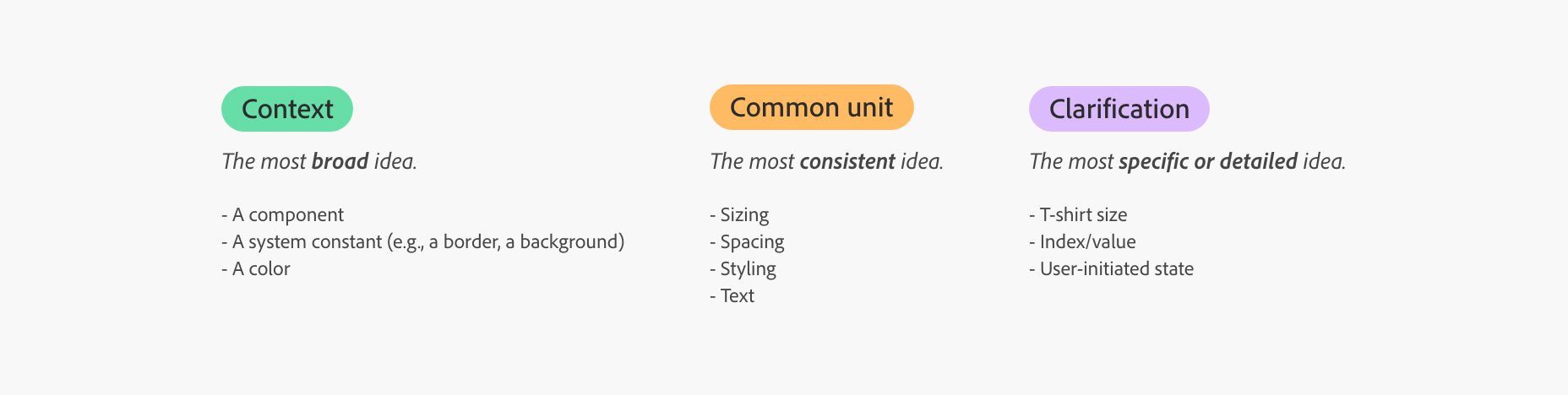
例如 :
gray-100:gray是一种颜色。gray-100是一种更具体的颜色,它指向光谱颜色系统中的特定值。checkbox-size-small:checkbox是一个组件,也是最高级或最广泛的概念。size是一个公共单位。small是一个说明。
类型
全局
作为全局 Token,通过字面意思就知道它并没有限定使用的范围,也就是项目中所有的 token 都可以从这里调取,无论是颜色、字体、行高还是圆角等。例如上述例子中gray-100
别名
它的存在是为了限定全局 token 的使用场景,这样可以让 token 更加场景化,可以被灵活调用,在后续的更改中自由替换。它的值都是从全局 token 中调取过来。例如color-disabled:var(--gray-100);
组件
这一步就是特别具体的,一般添加组件的的名称以及属性,可以直接进行开发,通常作为特定名称,大家基本上看了 Token 就知道它是什么。它的值一般从别名 Token 调取,在特殊情况下也会从全局 Token 中调取。例如button-background-color:var(--color-disabled);
实现
css
:root {
  --color-primary: #6200ee;
  --padding-medium: 16px;
}

.button {
  background-color: var(--color-primary);
  padding: var(--padding-medium);
  color: white;
  border: none;
  border-radius: 4px;
  cursor: pointer;
}
使用 js 创建:
const root = document.documentElement;
root.style.setProperty("--color-primary", "#6200ee");
root.style.setProperty("--padding-medium", "16px");

// 批量
var style = document.createElement("style");
document.head.appendChild(style);
sheet = style.sheet;
sheet.addRule("#myElement", "color: blue;"); // 老的浏览器支持
sheet.insertRule("#myElement { color: blue; }", sheet.cssRules.length); // 现代浏览器支持
styled-components
简单示例,通过
ThemeProvider,包裹的子组件通过theme属性获取到theme对象
import React, { useState } from "react";
import styled, { ThemeProvider, css } from "styled-components";

const lightTheme = {
  colors: {
    primary: "#6200ee",
    background: "#ffffff",
    text: "#000000",
  },
  spacing: {
    small: "8px",
    medium: "16px",
  },
};

const darkTheme = {
  colors: {
    primary: "#bb86fc",
    background: "#121212",
    text: "#ffffff",
  },
  spacing: {
    small: "8px",
    medium: "16px",
  },
};

const Button = styled.button`
  background-color: ${({ theme }) => theme.colors.primary};
  padding: ${({ theme }) => theme.spacing.medium};
  color: ${({ theme }) => theme.colors.text};
  border: none;
  border-radius: 4px;
  cursor: pointer;

  @media (max-width: 768px) {
    padding: ${({ theme }) => theme.spacing.small};
  }
`;

const App = () => {
  const [theme, setTheme] = useState(lightTheme);

  const toggleTheme = () => {
    setTheme(theme === lightTheme ? darkTheme : lightTheme);
  };

  return (
    <ThemeProvider theme={theme}>
      {/* ... */}
      {/* 也可以通过 ThemeProvider 的 theme 属性来覆盖主题 */}
      <ThemeProvider theme={buttonTheme}>
        <Button onClick={toggleTheme}>Toggle Theme</Button>
      </ThemeProvider>
      {/* ... */}
    </ThemeProvider>
  );
};

export default App;